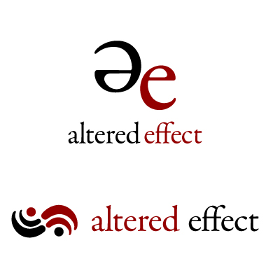
I have a sort of company, and people tell me that those things are meant to have logos. I didn’t believe it, skepticism comes naturally to me, but I kept hearing it. There was just so much corroboration, and eventually I gave up.
I’m finding it difficult. Designing for other people is one thing, but designing for myself is a billion times worse – and no, that wasn’t arbitrary quantification, well-defined equations were put to use for that conclusion.
I’ve been set on a colour scheme of red and black, using a jester-ish inspired alternation of colour. Especially in that colour scheme, it feels mysterious – maybe a little sinister. It’s probably just me.
It’s been a long process, and I’ve gone through illustrator files of logos deemed sub par for some imagined reason or other. I would continue to do so, for what I pessimistically predict to be forever.
Thankfully, sadly, (I am torn on the matter) necessity has intervened. I need a logo, and I need to commit to it as soon as possible. Within the next few days at the latest.
By the way, if you’re wondering what my company name is — and I certainly hope you are — it’s a secret.
Two of my latest attempts

I’ll probably be forced to pick from those, but I might have time to change the text’s properties. Oh, well. What can you do?
In conclusion, I would not want myself as a customer – I am too picky. I would go elsewhere if that didn’t seem ridiculous. Also I am bad at keeping secrets.


It’s funny how critical you get of anything you create. By funny I mean silly. Both those logos are awesome. Also let’s both get tattoos, you of AE and me of SenorSpine.