As you probably know, I designed the logo for Aquaflora Nurseries. In many ways, it has changed a lot from my original submission. Aquaflora very much wanted to use Arial Rounded MT Bold in their logo, which was not at all the fontograph I’d chosen. I switched it to VAG Rounded Std, and no one ever has to know.
Turns out they liked the change anyway, so that was a bonus.

To match the logo’s cartoony nature, as well as it’s strong and rounded text, I based their catalogue around bold, solid colours and rectangles with rounded edges. The catalogue headings make use of VAG Rounded Std as well, and welcome to the first step of ‘brand consistency’.
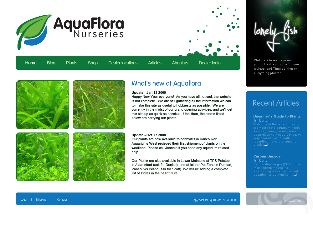
This morning, I designed a concept for their new website. It matches the catalogue for, again, brand consistency. The idea is that the relation between all Aquaflora products and documents becomes evident past the point of obvious. When potential customers come to the website after seeing the catalogue, they know that they have come to the right place.
And if we switch that around? Still true.
Better even, brand consistency lends itself nicely to a sense of familiarity for those exposed to it via various media. This is a good thing.


I do not know how you do all this impossible visual stuff. Also, that was a cool and very informative blog?
tyty. I think they’re only actually going to use the logo, though 🙁