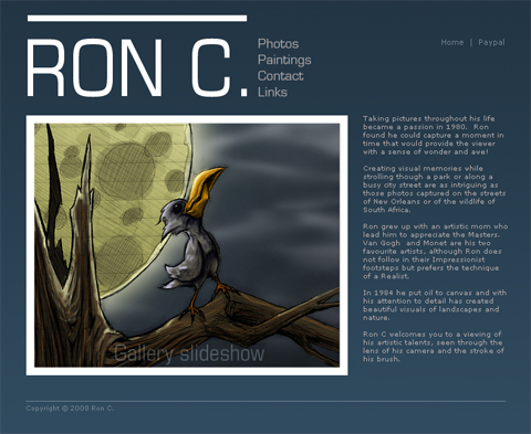
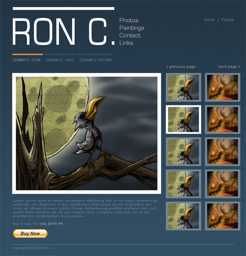
Tonight I was working on a website design for a paint and photography artist. To let his art speak, I settled on a minimalist design with a mix of varying contrast strengths to help direct the viewer’s attention.
Hey that's my bird in there!

And Tor's house!

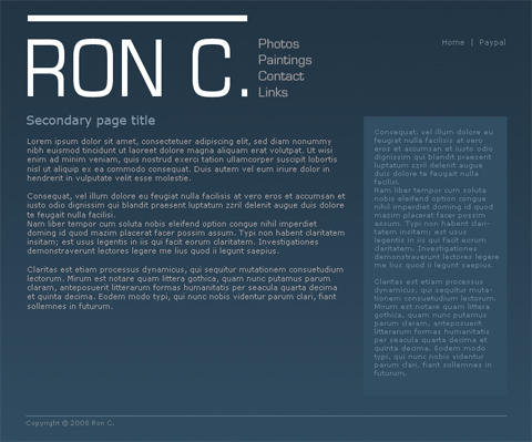
Secondary pages

I like it, though I’m not satisfied with the “Home | Paypal” menu on the upper right.
The website would make heavy use of sIFR. Well, not too heavy. More than I would normally like, but less than many seem comfortable with.
Thoughts?


You are good at typographies.
hahahaha ty. That was funny because Sheldon is going to be v. angry with you now.