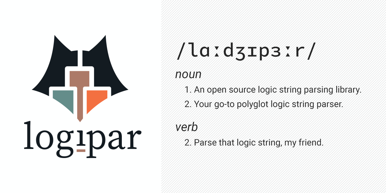
When designing the logo for logipar, I wanted it to evoke the feline. Because of /lɑːdʒɪpɜːr/ (lojipur) and the cat breed demo, sure. But also because cats are cool. They’re cute and sometimes fluffy. They have Instagram accounts.
I don’t know if it manages that but it is a cat’s head, so here’s hoping.
Once the design was ready in grayscale, it was time to pick some colours. I knew how I wanted them to work – just not which colours they should be. So I did that thing I do where I use programming as a form of laziness.
Each logo is defined by two colours, which it merges together at different ratios (and in the RYB colour model, so as to appear more natural to humans). The blackened version blackens the ears and uses the two defined colours on the next segment in. The half-blackened version merges the colours as normal, but then draws the ears in black (so the colours aren’t as vibrant).
You can try different colours out here:
Eventually I settled on this one:

Which you can see again here, in the repo’s social preview:


