This title is just as misleading, or rather inaccurate, as the other but it had to connect somehow, and using the same title seems confusing.
Continued is for chumps.
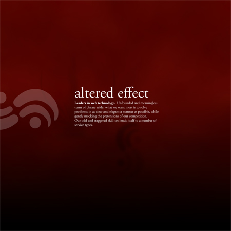
What I wanted to do was design a website based around the perception of depth. I think that could be really cool. It’s the kind of website that would impress and inspire me.
I also want to get one done in a quickish manner. And if Futurama has taught me anything, it’s that people hate things they are not immediately familiar with.
So, guys, let’s scale it back a bit. Let’s have things float in the backgrounds, at different depths distinguished by size, opacity, and blur. Let’s have depth alter, and particles and creatures drift, sink and swim, as if deep beneath some alien sea.
An animated background. Isn’t that always a bad idea? No, it’s not — though some might disagree. Adhering too strongly to convention can be a mistake of its own.
That’s not to say this will turn out well. But we can be hopeful.


