


I never like sharing google docs with people—they’re great when you’re editing a document together, but the reading experience could certainly be better. I don’t like the default styles, and even when specifically formatting a document for reading, there’s a lot going on to distract from that experience. And there’s no dark-mode for the web.
In the past, I’ve gone so far as to design PDFs or even webpages for viewing, but keeping two instances of what is essentially the same document up-to-date is a pain. Unfortunately, one of the great joys and terrors of being a programmer is that, in most cases, when you want to, you can just make things yourself.
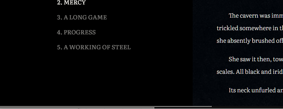
Which is all to say that I made a Google Doc viewer. Google docs, formatted for viewing. It automatically styles the document—we’re talking typeface, colours, line-height and text indent; titles, headings, sections, and styles for the first line and letter of each section.
It recognizes Google’s headings, titles and section breaks, but it also supports markdown style headings.
# Heading 1
## Heading 2
### Heading 3
#### Heading 4
It recognizes Google’s bold, italics, underline, and strikethrough, and it also supports some markdown styling.
_italic_
*bold*
And it automatically generates a table of contents (when applicable), which it to show your current position in the document.

There are two progress bars along the bottom that reflect how far you are into the current section as well as the document as a whole.
And the best part is that if I change the Google document it automatically comes through to the viewer. I never have to share a raw Google doc again. I can link to read.gigglingcorpse.com instead.
Here’s a sample document—no table of contents though, since there’s only one heading in this document.