Posts Tagged Web Development

Posted on Programming

Google docs: formatted for reading

I never like sharing google docs with people—they’re great when you’re editing a document together, but the reading experience could certainly be better. I don’t like the default styles, and even when specifically formatting a document for reading, there’s a lot going on to distract from that experience. And there’s no dark-mode for the web.

In the past, I’ve gone so far as to design PDFs or even webpages for viewing, but keeping two instances of what is essentially the same document up-to-date is a pain. Unfortunately, one of the great joys and terrors of being a programmer is that, in most cases, when you want to, you can just make things yourself.

Which is all to say that I made a Google Doc viewer. Google docs, formatted for viewing. It automatically styles the document—we’re talking typeface, colours, line-height and text indent; titles, headings, sections, and styles for the first line and letter of each section.

It recognizes Google’s headings, titles and section breaks, but it also supports markdown style headings.

# Heading 1
## Heading 2
### Heading 3
#### Heading 4

It recognizes Google’s bold, italics, underline, and strikethrough, and it also supports some markdown styling.

_italic_
*bold*

And it automatically generates a table of contents (when applicable), which it to show your current position in the document.

2. Mercy is bold because that’s the section it’s currently scrolled to.

There are two progress bars along the bottom that reflect how far you are into the current section as well as the document as a whole.

And the best part is that if I change the Google document it automatically comes through to the viewer. I never have to share a raw Google doc again. I can link to read.gigglingcorpse.com instead.

Here’s a sample document—no table of contents though, since there’s only one heading in this document.

Posted on Programming

Alert system details

So…. I designed my own query and templating languages (along with associated editors and complete with syntax highlighting). It was definitely overkill, but it was fun and now I can define alerts any way I like: easy ones, complicated ones, whatever alerts I want. With integrated documentation and helper functions to assist with defining your queries. As I’m sure you can imagine, this post expands on TWIG Irrigation alerts.

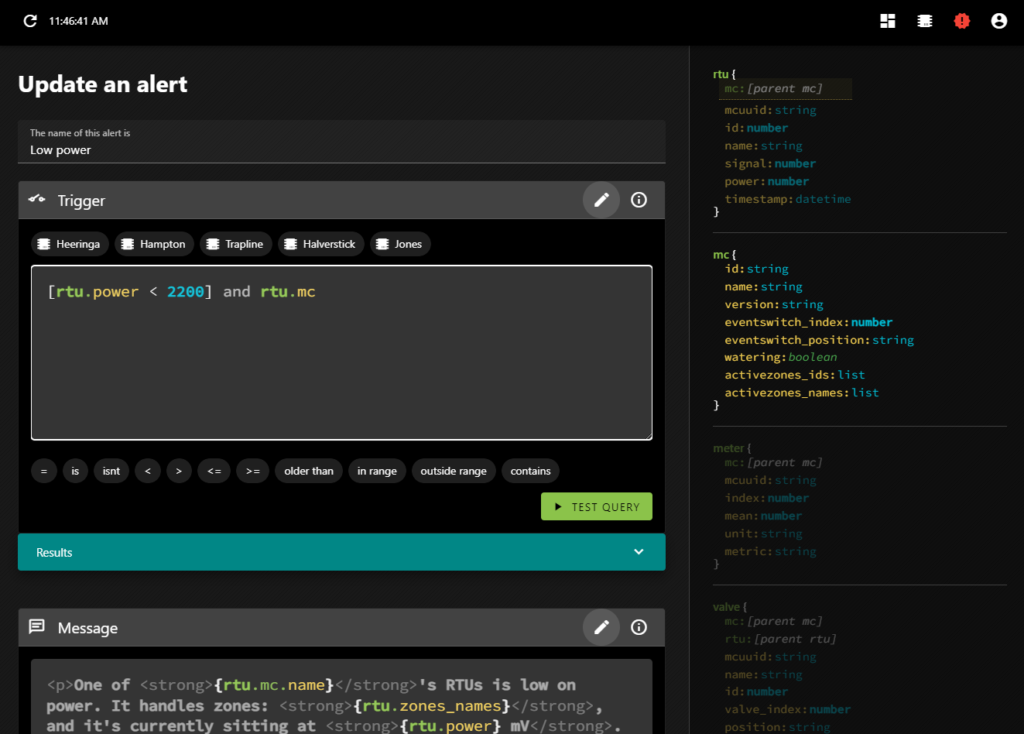
Let’s take a look at the interface with an example query:

An alert for when an RTU is low on power

The cursor (which you can’t see) is at the end of the line—right after rtu.mc. On the right, there is a description of the available data objects. RTU is opaque (but its properties are not, though you can see its mc property is highlighted). The editor detects where you are and organizes the objects on the right, highlighting the relevant information. It’s why the entirety of MC is opaque. So if you want to deal with a field particular to an MC, you know what they are and their datatypes. You can either type it in, or click on the field there and it will insert itself.

You can do a lot that way—just by clicking. The buttons above the trigger code block insert the MC IDs; each one represents a farm. The buttons below the trigger block insert the various conditionals you can apply.

And of course there is error checking:

rtu.mc.eventswitch_index expects a number, not a string.
olderthan expects to be used on a datetime, and to be used with a time offset, not a string.
rt isn’t a valid primitive.
fake field isn’t a real property of an RTU.

To learn about the trigger definitions in even more detail, you can click the little i in a circle which will reveal the documentation in-place.

But what about the query that got us here? [rtu.power < 2200] and rtu.mc

The first section is pretty obvious (it will return true if an RTU’s power field is less than 2200) but the rest looks a bit weird. but let’s ignore that for now and get into testing a query.

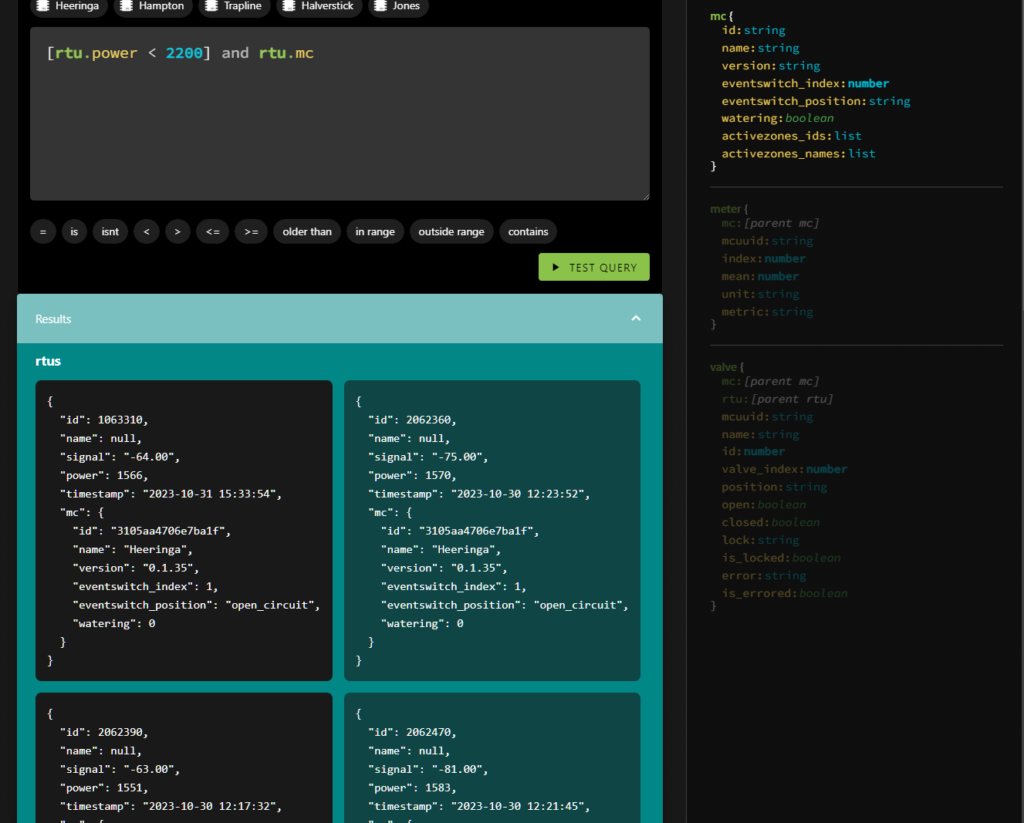
If you test a query and the query has no results it means that there is no error, and so the alert won’t be triggered yet. That’s great, but it’s not very useful when you’re working on an alert. You won’t see anything in the results tray, so you won’t have any handy examples to show you the shape of the data you’ll be able to reference in the alert itself.

That’s what the square brackets are about. [rtu.power < 2200] means that when testing the query, the system will ignore this condition. So if there are no RTUs with low power, you’ll still see results in the tray. They’ll just have power higher than 2200.

But why and rtu.mc? That has to do with enriching the results.

In the returned data, sub-primitives are only filled in as necessary, but you may find yourself in a situation where you want deeper access. If the query were simply rtu.power < 2200 you’d get back all the fields of the RTU, but the MC object wouldn’t be filled in. Which is fine, unless we want to reference one of the MC’s fields in the alert message. So an easy way to fill it in is just to include it in the query without an associated condition.

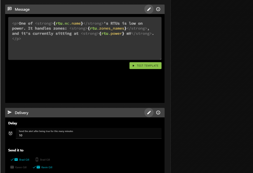
This is where you define the alert message and what happens when the alert is triggered.

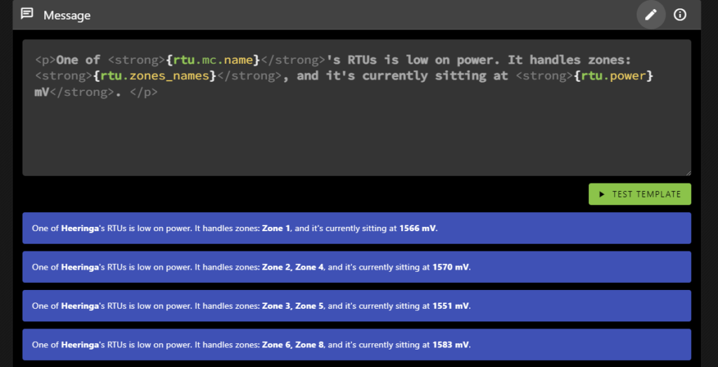
The message block is where you define what the alert will say when it is triggered. As you can see it allows HTML formatting, and you can insert values from the results. This message will be repeated, one for each result, all in a single message so you’re not bombarded with emails.

You can see that it references the MC’s name (the farm name), as well as the RTU’s power level. But it also includes a property not present in the results: rtu.zone_names.

Various primitives include helper properties (which you can learn more about by clicking on the i in the circle). rtu.zone_names returns the valve names associated with an RTU as a comma-delimited string, which can help you determine which RTU you’re looking for if you haven’t named it. In our case, the valves are often named for specific fields, but the RTUs are not.

The TEST TEMPLATE button will show you how the message will be rendered based on the same results TEST QUERY would generate.

And that’s pretty much it! Except that things can get much more complicated.

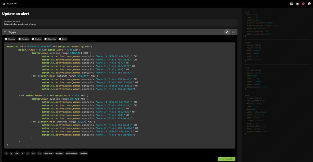
You may remember that in my previous post on the topic I mentioned that I analyzed the data and programmatically generated meter alerts for each farm? Let’s take a look at one of those!

The data contains pressure and flow metres, and depending on the field we may expect different value ranges.

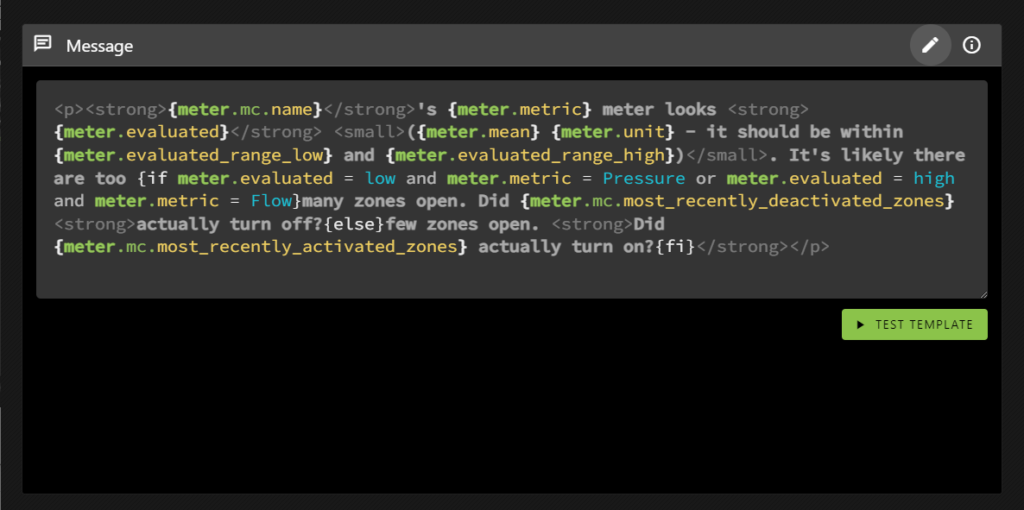
Oh, yeah, and the templating language allows conditional inclusion, where the conditions are evaluated using the same syntax as the query language.

Alerts aren’t re-sent until the system detects that they’ve been corrected. This means that if things continue to go wrong you won’t know, but also means that you wont’ have a bunch of cascading messages obfuscating what was most likely the root cause (the first error). That makes sense for something like meter range errors and it’s why I did all the metres for each farm as a single alert. That way you’ll only get one metre error per farm at a time.

It doesn’t make as much sense for errors that are unrelated (like the RTU power alert), but I can address that with an alert setting when and if it becomes an issue. It’s not overly important at the moment; since it can be currently handled by defining individual alerts rather than grouping them together.

Posted on Programming

TWIG Irrigation alerts

As you know, my brother is a farmer (via the professional poker player to farmer pipeline), but he doesn’t deal with just a single farm. No, he deals with many farms. Five, I think; and each one needs watering.

He uses the TWIG irrigation control system from Nelson. It’s great. He can set up irrigation plans and run them. He can even see what’s happening using their app… But only one farm at a time.

He wanted to see them all at once, so he contacted the company. They were very helpful. Travis got involved, suggesting (and vetting) various potential solutions, before mentioning something interesting…that they have an API, which they kindly gave us access to.

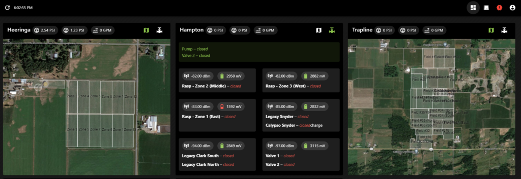
So I made it. A dashboard he can keep open on the office computer showing the current state of all things irrigation, across all the farms.

The map view of the farms

These screenshots aren’t the best example as they’re not actually watering right now, but those white boxes turn blue if a field is being irrigated, and they slowly fill as the watering progresses.

The valve view for one of the farms

He can see which valves are open, their signal strength and how their batteries are doing. There’s a chart view as well (when a irrigation plan is running) where he can see how far through the plan it currently is, what’s been watered and what remains to be watered.

Problem solved.

But, since I already had API access, he mentioned something else that would be useful: alerts.

So I built an alert system.

Green means everything is good. They change colour depending on their state.

It’s pretty cool. You can define arbitrary alerts—if a battery is low, if a pressure or flow meter is out of a certain range, if water is flowing when a irrigation plan isn’t running, etc. And since I was collecting all this data anyway, I recorded the meter values over a week or so and then ran an analysis to determine and auto-generate pressure and flow alerts for the different fields, at the farm level.

I might go into the alert system’s mechanics in more detail later, but for now let’s focus on things more interesting to people who aren’t me. Suffice to say that it’s perhaps a bit overpowered.

One of the neat things about these alerts is that, in many cases, information we’ve seen previously can hint at what or where something went wrong, and we can take advantage of that. If a pressure metre reads lower than expected, it’s probable that a valve didn’t close in the previous set of active zones. So it makes sense to check those fields first. And if you know that, maybe you don’t have to drive around to all of the fields checking that none of their valves are stuck open.

So when you get an alert like this—

Heeringa‘s Flow meter looks high (65.1 GPM – it should be between 33 and 53). It’s likely there are too many zones open. Did Zone 11 actually turn off?

—You immediately know you should check out Zone 11.

So, I mean, go check out Zone 11 or whatever. The valve’s probably stuck open.

Posted on Business

Hourible: the time tracking tool I use

I made a new online tool!

Okay so new is a bit of a stretch. It’s based on an internal tool I’ve used at altered effect for years now, but I’ve cleaned that up and now it’s available for public use:

Time tracking is the horrible. (see what I did there?) But does it have to be? I don’t know.

It’s one of the great mysteries of life, and something I worry we’ll never know the answer to.

Long story long, I wasn’t happy with any of the time tracking solutions I found so I settled on something quick and easy – using Google calendar. I was already comfortable using it, and I it was surprisingly intuitive to just drag events to the appropriate size in order to keep track of how much time I spend on projects.

It actually works wonderfully, but when it comes for invoicing you need to add up the hours.

Or do you? Trick quesion – you do, but Hourible does it for you!

Over whatever time frame you like. Plus, you can easily filter the events. Since I use Logipar any chance I get, Hourible supports logical operators in the filter string. It sums up your hours for you, and you can take a deeper look to see how they’re broken down.

Of course, you still need to make the invoices then. Which you can do manually if you prefer, or Hourible can generate them automatically with the click of a button. Which… is a lot less work for me than making them manually. It’s quite convenient actually.

All that and Hourible is free as you want it to be!

Give it a try if you want, especially if you regularly work on multiple projects or for various clients. Maybe it’ll help.

hourible.com

Posted on Programming

Dead by Daylight – filterable perks

Dead by Daylight has added so many new characters and perks since I made my original perk search tool – but worry not! I’ve created an updated version, powered by Logipar and based on data from the fandom wiki. Complete with scripts to help me easily integrate additional perks, as they’re added.

As always with Logipar, you can filter using logical operators like and, or, and not. Parentheses welcome.

You can query a field directly (character, description, name) using : to match if the field contains a value, or = to match if the field is a value. Or just type in regular text to check if it’s contained in any of the fields.

For example, character:ace will match Ace Visconti and Ghost Face. Whereas, character=ace will only match Ace.

You can finally search for rummage to remember that the perk is actually called appraisal. Now if only they would add something similar to the game itself.

Dead by Daylight, now with filterable perks. Available on GigglingCorpse. Give it a try today at https://gigglingcorpse.com/dev/deadbydaylight

Or, you know, below:

Posted on Programming

Gradient Vodka Soda

Gradient vodka soda is vodka soda with a novel twist – each bottle has a different amount of alcohol, allowing you to easily taper off your consumption through the night – which they call modern moderation. Check them out if you’re in the market for that sort of thing (and are of legal drinking age).

I programmed their teaser website, which had a bunch of interesting technical requirements. In this post I will go over a few of the more interesting tests I wrote. Most will work best if you have hardware acceleration enabled.

Rotating cans

The website revolves around a 3d can (see what I did there?). To accomplish this, I used, as I do given whatever excuses I can find, the programming language Haxe. And this time in particular, Heaps.

I got a 3d cylinder rotating, and applied a material to it. (It’s not really a cylinder, I made a model to account for the inset near the top.)

I ended up rendering each can to 2D, and positioning it that way. It made it easier to line everything up and prevented skewing from the camera’s perspective. This allowed the overlays to fit consistently. (The metal of the can, and the shadows on it are overlays.) The actual 3D can is just an ambiently lit label applied to the model.

But I couldn’t find an easy way to switch the labels on it; so I ended up writing a shader to do that. And so it went for so many more things –

But what if it was a shader?

I wrote a bunch of these to accomplish neat graphical effects. Heaps actually makes it pretty easy. Though, in most cases, I ended up moving away from the shader solutions to better support visitors without hardware acceleration enabled.

Ever moving blobs

The client wanted some subtle blobs floating around in the background, so I thought to myself, high on my recent shader successes, why not do it as a shader too?

I made a quick proof-of-concept, and it looked kind of neat, almost like a lava lamp. The blobs ended up getting cut in favour of a background video, which then also got cut.

Different sized dots

I tried dots a few different ways to see what which worked best. First I tested moving a small canvas with the mouse, and that worked fairly well. Unfortunately, requirements shifted so I tested drawing dots over a large canvas.

Performance wasn’t great, so I ended up using a small canvas to draw the dot at the appropriate size (the sizes change as you scroll), and used that as a pattern to fill in the larger, screen-sized, canvas.

That seemed to work fairly well, except that iOS apparently doesn’t send mouse events while scrolling, which interacts poorly when you’re making a scroll-based website.

Scroll-based flash animations

As you get to the bottom of the page, there is a box that the cans slide into. It was meant to close, spin around, and settle onto the ground, as you scrolled down. Unfortunately, we didn’t get the rotating box assets in time, so Sheldon amended the animation concept.

I figured it would be a pain to do in code, and animations are exactly the sort of thing Adobe Animate (formerly Flash) was made for. All I had to do was hack their JS to animation to progress through the timeline on vertical scroll rather than time. I wrote a quick proof of concept (and ran into a bunch of issues with more complicated, nested animations), but overall it worked really well.

So well that it got me wondering if that’s already a thing people do. If not, it seems perfect for this sort of website. Adobe should consider adding as an option to their JS output. Or maybe I should just release a library for it.

As an added bonus, using Adobe Animate let Sheldon prepare the animation himself, which meant less work for me!

There were so many problems

Most to do with different devices and browsers, and the different values between them. It took forever to track down and deal with these, but in most cases we managed to get the numbers to line up.

But one thing that kept cropping up was the matter of hardware acceleration.

I kept it turned off for my tests, but apparently some Macbooks have it enabled by default, but disable it when unplugged. This caused a number of surprises when people tested it, many to do with a feature I had implemented for just this purpose.

Framerate scaledown

All of these things going on could be quite a load on a slower system, at times making it painful to use. No matter what, I wanted the website to be useable – responsive design, but along the dimension of framerate rather than browser width.

To help with this, I implemented a system of framerate scaledown. Basically, the browser would check your framerate, and if it was too low too many times, it progressively disabled features.

I was pretty happy with this system. In a lot of cases it would just turn off interactions (remove the background video, make the dots non-responsive to mouse position, etc.). It worked really well, but in conjunction with the above it lead to some confusion. Sometimes the dots resizing under your mouse would work, and sometimes they wouldn’t (they wouldn’t work if they’d been disabled).

If you want to checkout the website, you can find it at drinkgradient.com

Posted on Programming

Don’t Starve Together – crafting tool, revisited

I haven’t played Klei’s Don’t Starve Together in quite a while, but there was an update recently which got me thinking about my DST crafting tool. With all the new additions, my data’s bound to be out of date. And even if I update it, that doesn’t really solve the problem, only delay it until the next update.

With my Conan Exiles data tool, I pulled the data directly from the game files – which I could access thanks to their modding support efforts.

Don’t Starve Together supports modding. I’ve even made mods for it. Could I do something similar there? Could I retrieve the data directly from the game files?

If I could, that’d sure help solve the issue.

Turns out I could.

Don’t Starve Together stores its data in Lua, XML, and Tex files, packaged into zip archives. So it’s not overly difficult to read the data from those files. It’s slightly more difficult to extract it in a usable format – many of the definitions reference (and arithmetically modify) other definitions.

But now I have a script for that.

So next time there’s an update, I should just be able to run that script to refresh my data. Here’s hoping.

Also, here’s a link to my don’t starve together helper tool.

It should be pretty intuitive, but click on the ? Icon for further usage instructions in any of the sections. There’s some neat stuff in there. I integrated Logipar into it.

The first two tabs (What can I make, and What do I need) should be fairly helpful. I used them a lot in their previous incarnation. The third (Recipes) less so.

I’m not clear on how the Recipes section should work, yet. Or what it should be. So I just threw something quick up, in the hope that it would help toward figuring out where it should go.